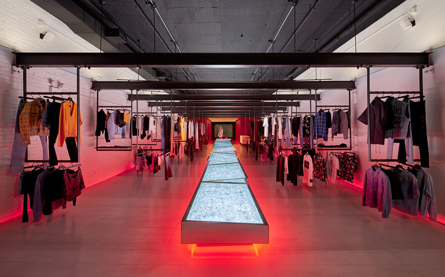
Dan Brunn Architecture’s design for the RtA Soho Store represents the brand’s third location, building upon the design principles established at its Los Angeles and Las Vegas counterparts. The objective was to evolve the design language while integrating seamlessly into the historic and gritty atmosphere of Soho.
Material Fusion
Within the expansive 14-foot-tall space, a diverse array of materials come together to create a minimalist yet edgy backdrop for the fashion house. From wood plank floors to rubberized red fitting rooms, Corian surfaces, blackened steel beams, and Baccarat crystal elements, each material is carefully selected and integrated into the design.
Spatial Organization
The store layout revolves around a central axis, dividing the space into two distinct zones for different collections. In response to the challenges posed by the pandemic, the design incorporates smaller, more intimate spaces within the larger area. This was achieved through the installation of new structural blackened steel I-beams at ceiling height, allowing for flexible displays and the creation of individual “rooms” defined by the products.
Merchandise Display
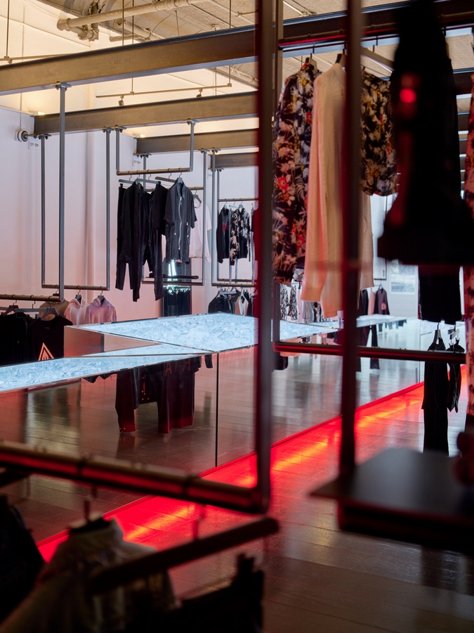
Merchandise is elegantly displayed along the axis, with custom blackened steel hardware systems suspended from the I-beams. This not only enhances the presentation of clothing but also maintains the spatial integrity and depth of the store, creating an immersive shopping experience for visitors.
Artistic Highlight
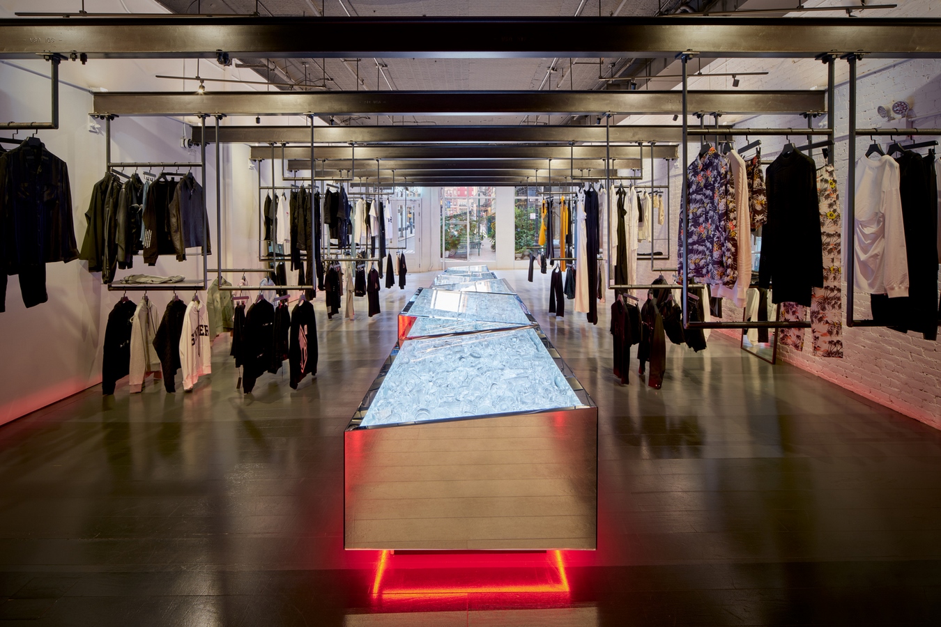
At the heart of the space stands a striking art installation—a collaboration between the architect and Baccarat. Dubbed the “crystal disco ball,” this mirrored sculpture showcases nearly 1,000 pounds of Baccarat crystal, salvaged from discarded pieces. Each display case, adorned with geometric mirrors, is meticulously crafted to reflect light and create a mesmerizing effect throughout the store.
Interior Ambiance
The store’s interior features a gradient epoxy-painted wood floor, transitioning from white near the glass facade to black at the rear. This gradient not only minimizes glare but also enhances the play of light within the space. At the rear, a custom-designed Parisian Café style red velvet sofa serves as a focal point, flanked by arched fitting rooms illuminated with red LED lights and lined with matching curtains.
Embracing Imperfections
One fitting room showcases an existing eroded brick wall, celebrated using the traditional Japanese “Kintsugi” technique of golden joinery, highlighting the beauty of imperfections. This unique touch adds depth and character to the store, reflecting a blend of tradition and innovation.
Technological Integration
At the end of the central axis, a projection wall collaboratively curated with RTA displays the latest collections, seamlessly integrating technology with the store’s aesthetic. This dynamic feature enhances the shopping experience, providing visitors with insights into the brand’s latest offerings.
In essence, the RtA Soho Store by Dan Brunn Architecture not only pays homage to the brand’s identity but also captures the essence of the Soho district, bridging history with modernity in a harmonious fusion.

